Tag Archives: #typography

Soumkine

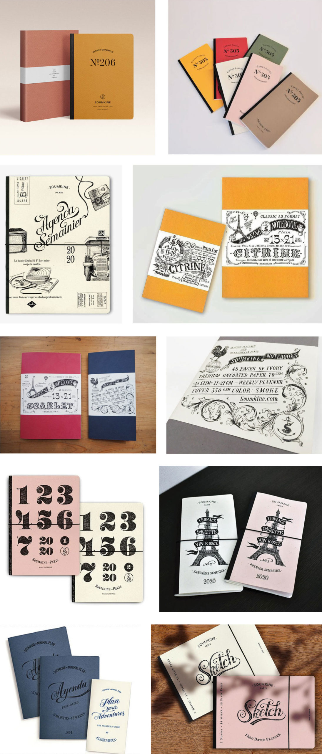
Have always carried a notebook despite the digital conveniences.  That’s why we love this Paris-based company, Soumkine, a brand bent on reviving the paper and writing culture. In 2016 Soumkine was launched producing simple but thoughtfully designed notebooks and planners. Each notebook is made of high-quality Italian paper and bound by hand at their Parisian atelier.  The books are hand-stitched in the beautiful tradition of pre-1950s French bookbinding.  Their graphics are designed by Fiodor Sumkin the company’s typographer and founder. The process of making a Soumkine book is explained here in their blog.

Their products can be viewed on their website, Facebook and Instagram.

Images:  Courtesy of Soumkine.

NEWFLIX.Bro

Love this elegant font created by the design team, NEWFLIX.Bro.  There isn’t much information on the studio except that they are a team of young people from Indonesia passionate about design, technology, illustration and typography.  The font, Valky, is a classic modern typeface that draws inspiration from lovely vintage serif typefaces. It comes with a wide range of beautiful ligatures as well as plenty of special alternative glyphs and ornaments. It’s perfect for many projects packaging, magazine headers as well as for personal use.  

You can see more of NEWFLIX fonts here on Behance.  The Valky font can be downloaded on Creative Market.

Images:  Courtesy of NEWFLIX.Bro.

Mario De Meyer

Since 2010 Mario De Meyer worked as a freelance graphic designer based in Ghent, Belgium. His strong focus is on typography but has also concentrated in abstract designs.  He has worked with a variety of clients worldwide such as IBM, Fortune, Adobe and Wired to name a few.  On the blog 8Faces he says this about his work:

“My love for lettering is something that grew over the years. During school typography lessons were always one of my favourites, but I never thought back then that it would become my main focus. Typography wasn’t so big back then. I think my love of lettering actually came from frustration. Belgium is a pretty complicated country and the fact that we have two languages (Dutch and French) doesn’t make it any easier. Certainly when you’re a designer, clients don’t want two designs but still require two languages.”

“This frustration was healthy in a way. As a reaction I started designing stuff for myself for fun, with my own philosophy and to challenge myself.”

The artist can be followed on his website, Behance and Instagram.

Images:  Courtesy of Mario De Meyer.

%d bloggers like this: