Myriam Dion

We love it when artists reuse materials and incorporate them into their design.  Canadian artist Myriam Dion cuts rich textural patterns reminiscent of embroidered lacework right into latest edition of newspapers pages such as The Financial Times, International Herald Tribune and Le Devoir to name a few. She is careful to respect whatever newspaper she is transforming, invents new scenes, landscapes and narratives within the pages to bring the newspaper’s stories to life. On an article in Huffpost the French-Canadian artist says this about her work:

“By crafting thoughtful mosaics out of the world events, I question our appetite for sound-bite news and sensational art, showing the quiet power of a patient hand and an inquisitive eye.  I am creating a new newspaper that can be interpreted, that encourages people to think more deeply about the news that we consume too easily.”

  The artist can be followed on her website and on Instagram.

Images:  Courtesy of Myriam Dion.

Indra Dugar (1918 – 1989)

We have an affinity for surface designs so we just had to share these costumed women series created by Indra Dugar.  The artist was born in Jiagunj, West Bengal in 1918 and died in 1989 in Kolkata. He did not have any formal education in art, unlike his eminent artist father, Hirachand Dugar. His art techniques and practices was acquired from his father without going through any academic routine.  This gave him a rare individuality that distinguished him from other artists. Besides his woman series he has also created landscapes both of which were usually created en plain air.

Images:  Courtesy of various sources.

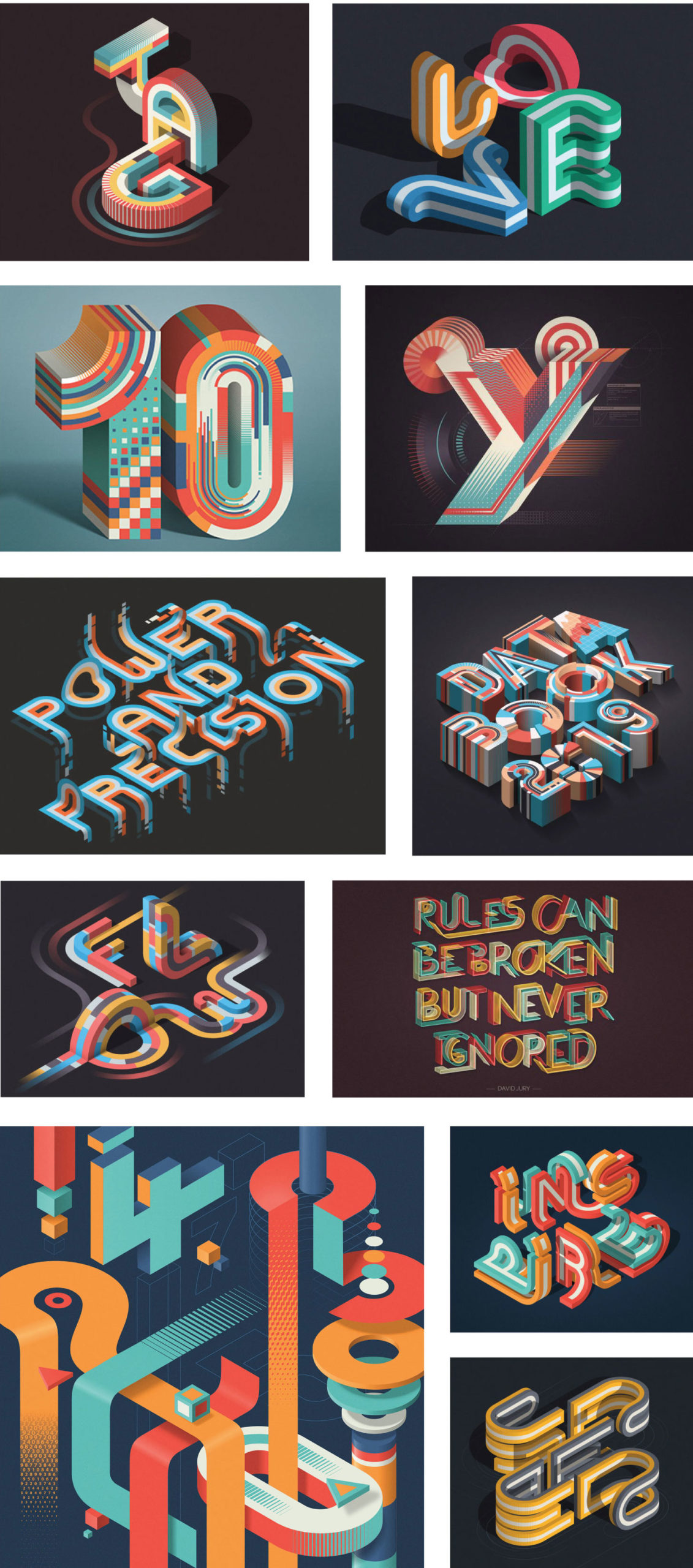
Mario De Meyer

Since 2010 Mario De Meyer worked as a freelance graphic designer based in Ghent, Belgium. His strong focus is on typography but has also concentrated in abstract designs.  He has worked with a variety of clients worldwide such as IBM, Fortune, Adobe and Wired to name a few.  On the blog 8Faces he says this about his work:

“My love for lettering is something that grew over the years. During school typography lessons were always one of my favourites, but I never thought back then that it would become my main focus. Typography wasn’t so big back then. I think my love of lettering actually came from frustration. Belgium is a pretty complicated country and the fact that we have two languages (Dutch and French) doesn’t make it any easier. Certainly when you’re a designer, clients don’t want two designs but still require two languages.”

“This frustration was healthy in a way. As a reaction I started designing stuff for myself for fun, with my own philosophy and to challenge myself.”

The artist can be followed on his website, Behance and Instagram.

Images:  Courtesy of Mario De Meyer.

%d bloggers like this: